

Discover more from Iterations
Asking me to pick my favorite photographer is sort of like asking me to pick my favorite Beatles record — on most days it’s Abbey Road, but it could also be Revolver or Let it Be. As much as I love photographers like Richard Avedon, Sally Mann, Saul Leiter, and a hundred others, no photographer has inspired me or captured my attention and imagination as deeply or consistently as Gregory Crewdson. I was first introduced to Gregory’s pictures through a body of work called Beneath the Roses. After seeing just a few images, I was hooked. There was just something about his ability to create so much nuance and depth in a single frame.
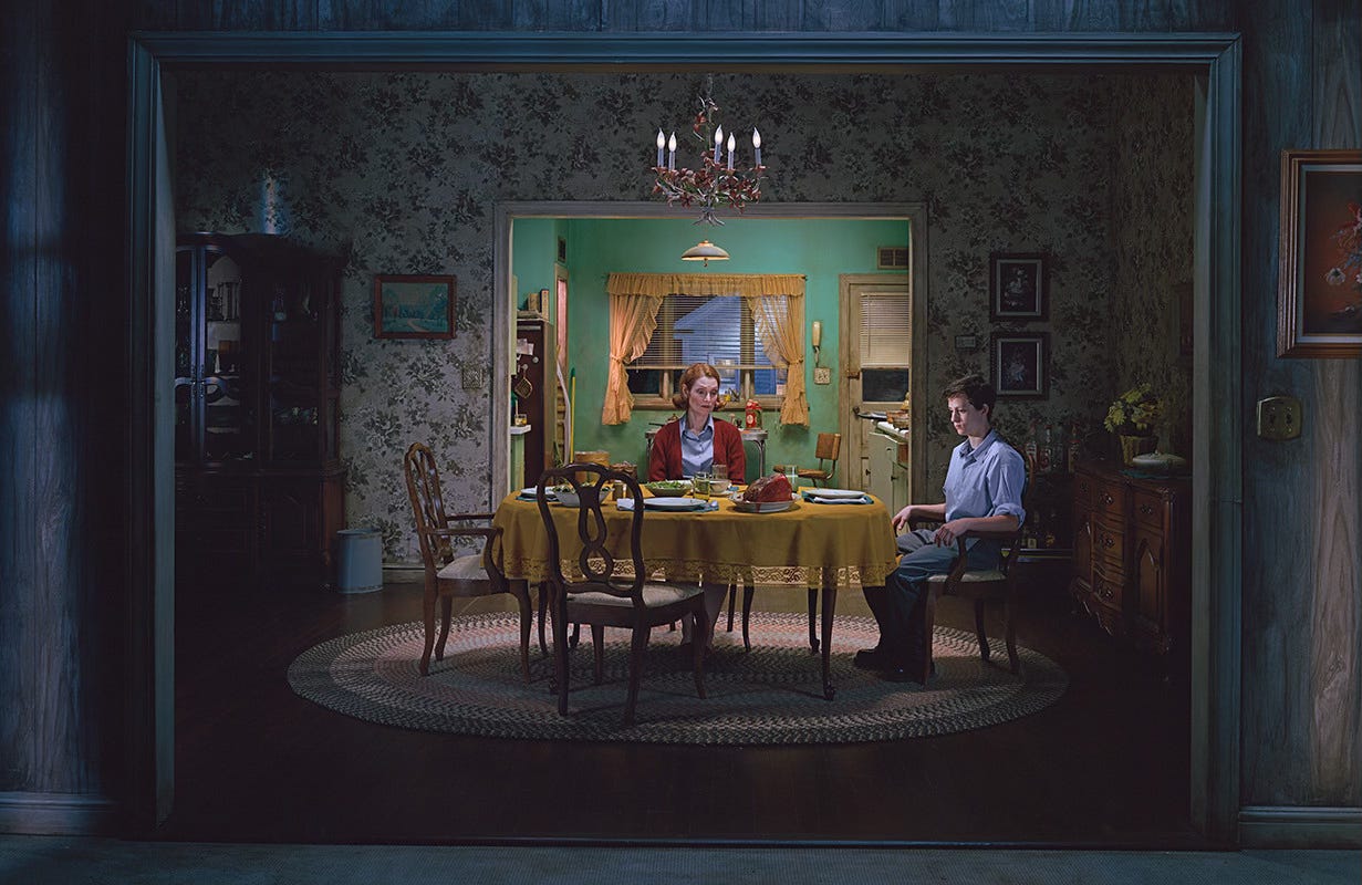
Whereas most photographers capture the world as it exists around them, Gregory seemed to create a world of his own — built from decades of imagination, memories, and lived experiences — and with each new body of work, he invites us back for another visit.
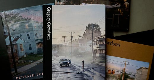
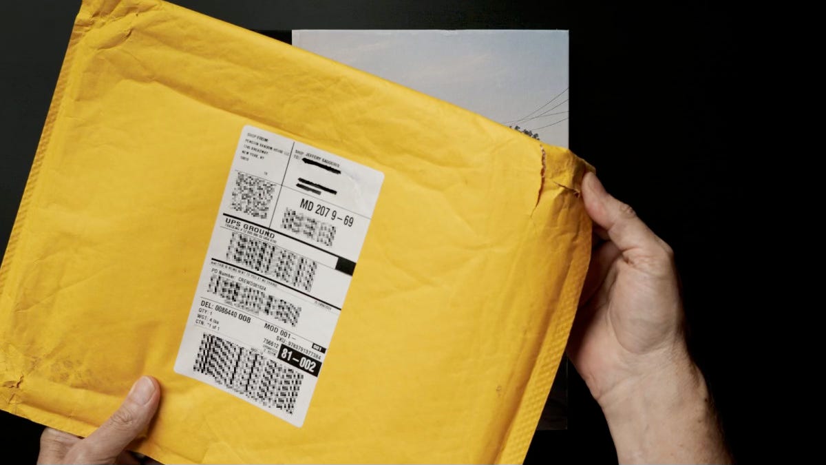
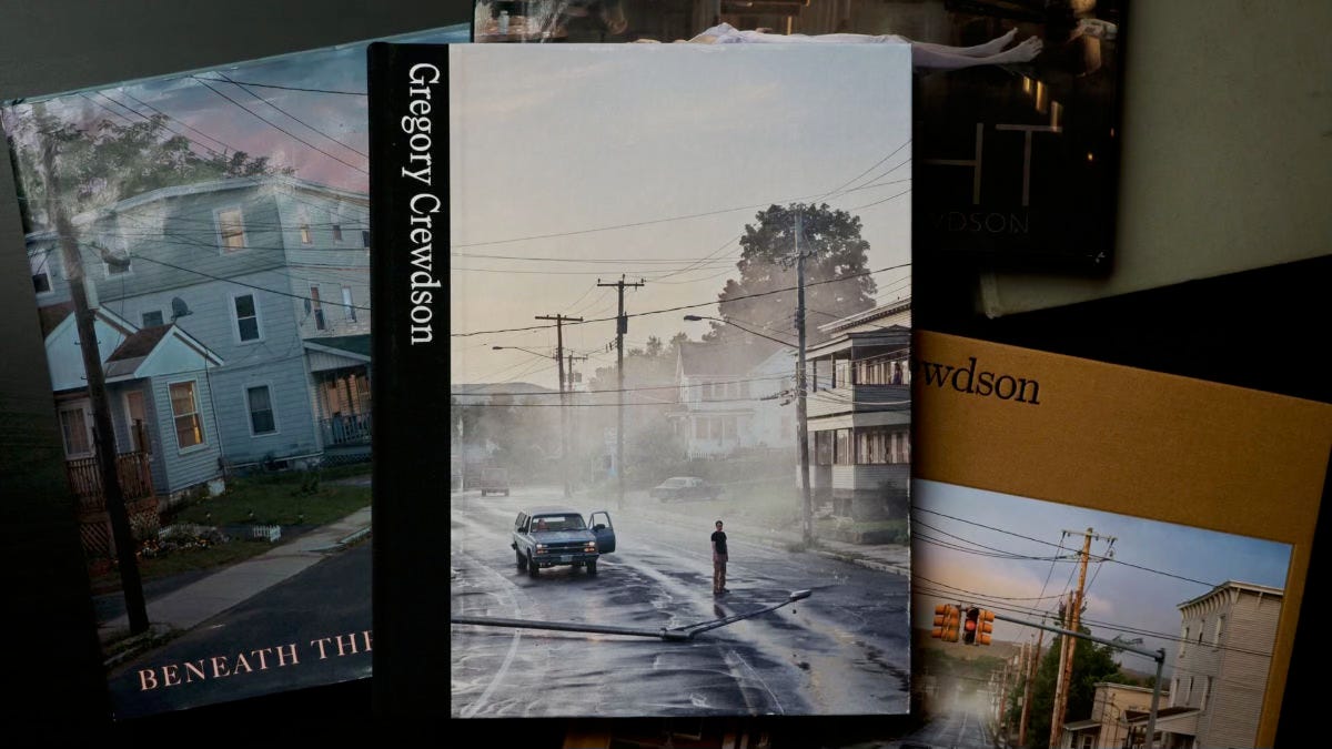
In a new book from Prestel, simply titled Gregory Crewdson, editor Walter Moser — the head of the department of photography at the ALBERTINA in Vienna — has curated a selection of images from all of Crewdson’s major bodies of work. Prestel was kind enough to send me a copy for review and I couldn’t be more thrilled to talk about it, but before we jump in I feel like I have to make a comment. It’s more of a request, really, and not just to Prestel but to all publishers and bookshops who insist on shipping $60, $70, even $100 books in these flimsy paper envelopes.
Please, just stop. As you can see, they often arrive with some sort of damage. This one is torn on three corners and looks as if it was run over by the UPS truck that delivered it — and the book itself was damaged as a result. I was able to repair some of the damage to the cover, sort of, but speaking as someone who buys a fair number of art and photo books, it’s extraordinarily disappointing to receive a package like this. So please, just stop. Spend a little more and use a box and proper padding. Take as much care in shipping us your books as we will in enjoying them.
OVERVIEW
All right, with that out of the way, I love monographs when it comes to art and photo books and I actually own quite a few. The beauty of a monograph like this is that we get the highlights of the single-body volumes like Twilight and Beneath the Roses, for example, along with the opportunity to explore visual and thematic connections between multiple bodies of work. Granted, in this case you don’t get quite the same viewing experience as you do with the larger books — and with Crewdson’s work, I think bigger really is better, which I’ll come back to — but you also aren’t spending hundreds of dollars on multiple volumes.
CONTENT
This book is a comprehensive look at Crewdson’s entire photographic career, from the Early Work project he did as a grad student at Yale to his latest project, Eveningside. Each body of work features a brief introduction by Astrid Mahler along with any influences that may have inspired the work, such as citing Edward Hopper in the introduction to Beneath the Roses.
One series missing from the book is Dream House, which is a portfolio of 12 pictures that appeared in the New York Times Magazine in 2002. The only visual references to it are pictures of Julianne Moore and Tilda Swinton that appear as part of Matthieu Orléan’s essay. You can still see the whole set, along with some behind-the-scenes photos, in an archived version of the New York Times Magazine site, which I’ll include a link to in the notes.
Other than that, I think all of his conceptual work is represented to a greater or lesser degree, which as I said earlier, is fantastic to see in one volume. The only other book that comes close in terms of content is a 2013 Rizzoli monograph, which is out of print and selling for hundreds of dollars on the secondary market, and it doesn’t include the three most recent bodies of work.
In addition to the work itself, there’s a substantial collection of behind-the-scenes photos showing the various projects of being created, along with an essay by Walter Moser that unpacks the making of the work. I think this is an important addition because it illustrates what an enormous undertaking it is for Crewdson and his team to realize his pictures. And from a design perspective, I love that this section is on an uncoated paper. It helps it to stand out from the rest of the book and makes it feel like the literary equivalent of bonus features on a DVD.
In addition to the “making of,” the book features a handful of additional essays, including one by David Fincher, who is one of my favorite directors and a terrific choice to include here. I can’t think of another director who displays the same fastidious attention to detail as Crewdson in his work. Fincher’s essay draws comparisons between Hitchcock, Spielberg, and of course, David Lynch. I love how he describes his own reaction and ongoing fascination with Crewdson’s work:
“I find myself drawn to what Crewdson is doing, not simply because of its painstaking and exquisite execution, or the alchemy of the content within this execution, but also because he’s specifically saying: “There’s no coverage. No progression. No other angles. You’ll have to imagine where all this takes you.”
I think he’s exactly right. Crewdson has talked about some of the recurring themes in the work, but never — at least to my knowledge — has he mentioned specifics about what a particular piece or a body of work represents. He certainly didn’t offer any specifics in the conversations I’ve had with him.
Emily St. John Mandel, author of books like Station Eleven, The Glass Hotel, and Sea of Tranquility, takes a different approach. Instead of writing an essay about the work directly, she selected a number of pictures across his entire body of work and crafted her own backstories for them based around what she sees and what the work represents to her. It’s kind of a brilliant choice because it’s what all of us do when we’re standing in front of Crewdson’s pictures.
“She calls herself the Cobra, but that isn’t her name. She named herself after a broken ride from a long ago circus. She says she can see the future, but so can I, we can all see the future, it’s all around us, and that’s why we do the things we do, that’s why we set fire to the Red Star container and spent all night taking down the lamp post on Starkfield, took it down and laid it across the road facing the wrong way because we wanted to disrupt the trajectory, as Sarah put it. We wanted to keep the future at bay.”
DESIGN
The overall design of the book is a bit of a mixed bag. While I do love how much work is included here, presenting it in portrait orientation rather than landscape feels like an odd choice. Why does this matter? This may just be a personal preference, but Crewdson’s pictures are so rich with detail that they really do want to be seen big. Remember — some of his framed prints are 5x8 feet, which when seen in person can fill your entire field of view. His work is meant to be considered, absorbed, and pored over. The scale and landscape orientation of previous volumes like Twilight, Beneath the Roses, and Alone Street allowed for a much more satisfying viewing experience for me.
Print quality and color seem mostly good, although it’s different than the other books. For example, if you look at the same image in Gregory Crewdson and Beneath the Roses, there’s an obvious difference in color between the two photographs. As to which one is more accurate, that’s hard to say without standing in front of the print. I know which one I prefer, but that doesn’t mean it’s the most accurate. Comparing another image in the new book to the same one in Alone Street, there’s also a color difference. It’s not quite as dramatic as the previous comparison, and again, it’s subjective as to which one is better. Without comparing them side-by-side or to one of the prints, I doubt most people would notice or have an issue.
Despite the physical size and portrait orientation, there are a handful of double-page spreads in the book, which I’m not typically a fan of. On one hand, it’s nice to see the images at a larger size, but you lose center detail to the gutter. If you look at the same image from Gregory Crewdson and Alone Street, both are double-page spreads, but in the Alone Street version, the gutter isn’t right down the middle of the image. So while the image is technically a little larger in the new book, I much prefer the Alone Street version because less of the main elements of the image are lost to the gutter.
There are a couple other minor things that are probably just me. I may have chosen a different font for the essays, or at least just increased it by a point size or two. The one thing that does bother me is the size of the inner margins, specifically on the left page. It’s not as much of an issue with the photos, but when reading the essays, I found myself having to shift my viewing angle or adjust the way I held the book to read the right edge of the columns. With so much negative space to the left, this feels like an odd design choice. And the size of the left inner margin is different than the right, at least in the essays, which makes the layout feel imbalanced. Again, these are little things that most people probably won’t even notice.
WRAP UP
Despite the few issues I have with the design and layout, this is a terrific book. If you’re already a fan of Crewdson’s work, it’s a no-brainer, especially if you don’t own any of his other books. If you’re not yet a fan, this is a fantastic overview of — in my opinion — one of the most compelling and intriguing photographers working today.
Be sure to check the notes for links, including one to the Crewdson Trail Log newsletter on Substack where Gregory and Juliane share behind-the-scenes posts and updates on new work. In fact, the most recent entry is a look at the making of Beneath the Roses. Thank you again to Prestel for sending the book over for review and thank you to Gregory and everyone at Crewdson Studio for continuing to invite us back for a visit.
LINKS
Gregory Crewdson - ALBERTINA modern
Making Eveningside
There But Not There - Gregory Crewdson Documentary
Crewdson Trail Log
Beneath the Roses - Crewdson Trail Log
Dream House Archive - New York Times Magazine
Gregory Crewdson on Process Driven
David Fincher - Invisible Details
BOOKS1
Gregory Crewdson (Amazon | Bookshop | AbeBooks)
Eveningside (Amazon | Bookshop | AbeBooks)
Alone Street (Amazon | Bookshop | AbeBooks)
Beneath the Roses (Amazon | Bookshop | AbeBooks)
Twilight (Amazon | Bookshop | AbeBooks)
Station Eleven (Amazon | Bookshop | AbeBooks)
The Glass Hotel (Amazon | Bookshop | AbeBooks)
Sea of Tranquility (Amazon | Bookshop | AbeBooks)
FWIW - These are not affiliate links.










Thank you for this deep review, can’t agree more about packing.
As per color, I have seen the book right after spending a good amount of time in the exhibition, obviously unfair comparing a mass production book on decent paper to a masterfully printed art on somerset paper, and yet the difference is obvious, so obvious I couldn’t pick the book even that I really wanted to.